Minimalism is a web design trend that has gained popularity in recent years. Minimalist websites are designed in a way that exemplifies a less is more approach. Minimalism favours well designed, professional websites with a clean look and feel. Generally, this includes a simple colour palette, understated but bold typography, few competing elements and a single focal point. This is in contrast to a maximalist approach which believes in a more is more philosophy and often includes a lot of different elements, images, colours and fonts. But why is minimalism important for website design? Here are some reasons why!
Why is Minimalism Important in Website Design?
- Minimalist websites are more intuitive for navigation
- A single focal point on a webpage is better
- Minimalist websites load faster
- Minimalist websites are easier to optimize for mobile devices
- A minimalist colour palette is easy on the eyes
- Minimalism ensures clarity of purpose
- Minimalist websites look more professional
Minimalist websites are more intuitive for navigation
Think about clicking on a website only to be greeted with an overload of text and images. You wouldn’t even know where to look or where to go to get the relevant information that you need! In contrast, a clean, minimalist design reduces the number of competing elements on a single web page and makes navigation much easier and intuitive. Minimalism features among the top web design trends. Do read more about the top web design trends here.
Do check out our selection of 25 best portfolio websites built with Pixpa, which are full of stellar web design lessons to help you level up your portfolio website and make it stand out!
A single focal point on a webpage is better
Having too many competing elements on a web page can also mess up the visual hierarchy of the page. This is especially true of landing pages. When there is no single point of focus to catch the viewer’s attention, the page looks like a mish-mash of confusing elements. Having a single, clean but impactful focal point, for example, a logo or a slogan in simple, bold typography, improves the impact factor of your website and landing page. Talking of typography, have a look at these outstanding design portfolio websites built with Pixpa for inspiration.
Minimalist websites load faster
Having too many elements on any single page also makes your website load much slower. Too many graphics, a fussy background, a complicated font, video elements etc take time to load and this can hamper your website’s overall load time. Slow loading times can discourage people from properly exploring your website or even opening it at all. Faster loading times are also a factor in the search engine rankings so minimalist websites tend to perform better in terms of SEO in comparison to overcrowded or fussy websites. Want to learn more about SEO? Here is a complete guide to understanding SEO for photographers and creatives.
Minimalist websites are easier to optimize for mobile devices
In general the simpler your website, the easier it is to optimize for mobiles. By getting rid of extra or unnecessary elements you reduce the amount of optimization you need to do. Minimalist websites also work well on mobile because smaller screens tend to get more easily overwhelmed with complicated pages. Everything is maximized when it is on a small screen and therefore starting out with less is always better.
A minimalist color palette is easy on the eyes
A fussy color palette can be too overwhelming to look at and may lead to an unpleasant viewing experience. The typical minimalist color palettes of whites, grays and blacks are designed to be soothing to the eye, easier to parse and faster to load. However, minimalism does not mean that you have to stick to cool or neutral tones. Minimalist websites can use brighter colors but you need to pick a limited number of colors and make sure they complement each other well. In this listicle we will also take a look at minimalist website examples with brighter color palettes.
Minimalism ensures clarity of purpose
With minimal websites, there is a clarity of purpose. Because you have removed the clutter and all of the unnecessary elements from the equation, you can put your energies towards focusing on what is important. This enables you to create precise, impactful and intuitive websites. When you look at a minimalist website you are immediately and easily able to figure out what it's all about.
Minimalist websites look more professional
Simply speaking, minimalist websites just look better and more professional. This is because of all the aforementioned reasons. An intuitive, easily navigable website is preferred in a professional environment. Having a single focal point ensures that people immediately know what your purpose is. Fast loading times, a simple and neutral colour palette and clarity of purpose are also important. All of these make minimalism the better and more professional choice for your website. Here is a detailed step-by-step guide on how to design your website. You might also want to read our article on how to create an online portfolio to showcase, sell and share your work online.
Pixpa's all-in-one professional portfolio website builder makes photographers and creators feel right at home. Start with beautiful templates that you can completely customize to match your style and requirements. Showcase, sell, and share your work online easily, with a built-in store, blog, and client galleries. See all features that allow you to build and manage your professional website with Pixpa without coding knowledge.
If you have been struggling with finding the perfect layout and minimalist vibe for your website then worry not, because we have got your back. We have looked far and wide to collect and bring the best minimal website examples built with Pixpa to serve as design inspiration for you! Let us take a look at some of these stunning websites and learn by example!
Here are 30+ Best Minimalist Website Examples to Inspire You!
Micah Johnson

Micah Johnson’s website is the very epitome of less is more. From the simple, lucid sans serif font to the plain white background, everything works to bring the viewer’s eye to the most important parts of the page– Micah’s name, his profession as a designer and the samples of his work. Micah’s website is an excellent example of how minimalism can help improve the visual hierarchy in the layout of your website.
Kim Dero

Kim Dero is a designer and his beautiful minimalist website is a great example of the fact that minimalism doesn’t necessarily have to be cold or sterile. Kim uses warm tones like reds, oranges and yellows for his website. This is visible in the main image of his landing page but also more subtly through the font and link colors. Kim’s website is an example of how you can make your minimalist websites more fun.
Lulu and Isabelle

Oanh Tran is the designer behind Lulu & Isabelle. She is an illustrator, photographer and graphic designer. She has gone for a text light approach with her minimalist website in order to highlight the images. This immediately grabs the viewer’s attention and also serves to highlight her work which is what she wants to be the focal point.
Maria Maka

Maria Maka is a designer who works to create better visual experiences for her clients. Maria’s website is an excellent example of how minimal websites and minimalistic design practices help in creating better and more intuitive visual experiences for users. Both text and images are used deliberately and purposefully to create an intuitive, minimal website experience.
Benny Cuppini

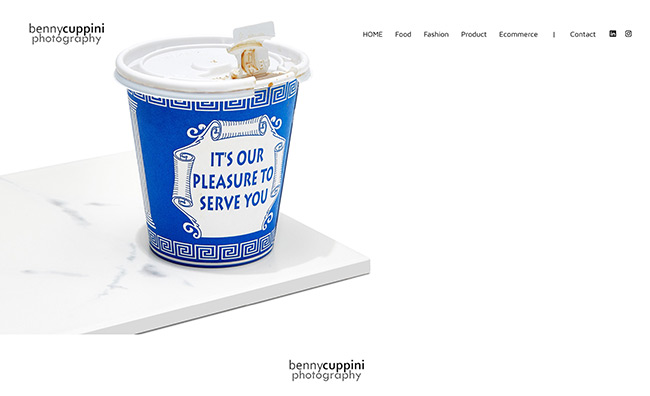
Benny Cuppini’s website makes great use of minimalism to reinforce visual hierarchy. His work occupies centre stage on his website and the image carousel ensures that he can display his work across industries and genres without cluttering his landing page with too many images. Neutral font colour and vibrant image background make his website vibrant and poppy.
Aneev Rao

Aneev Rao’s beautiful minimalist website reminds us of a page from an old-timey photo album. A profile portrait on an understated, deep blue background occupies centre stage on his landing page with links to his portfolio on the side. This does a great job of both making an impact as well as introducing us to his work.
Little Peking

If you were looking for minimalist website examples to learn how minimalism can be of benefit to business websites, look no further. The Little Peking restaurant’s website is clean, uncluttered and to the point. The large buttons also double in as images and bring in a pop of color and liveliness to the landing page. The owners’ picture is front and center bringing in an element of humanity which is very important for all business websites.
Marcel Steinegger

When you think of minimalist websites, you may think that they lack an impact factor. Photographer Marcel Steinegger’s website will prove you wrong. By putting his stunning, dramatic nature and astrophotography as the backdrop to his website, Marcel brings in a sense of drama and impact while maintaining minimalism.
Do Not Fret Citizen

You don’t have to stick to plain whites and blacks when creating minimalist websites and nothing showcases this better than Indian artist Abhiram Reddy’s website. The bright pink background, the lowercase letters, unique font choice and Abhiram’s dramatic, contemporary art, all come together to create a visually stunning and unique, minimal website.
Joy Schranghamer

Joy Schranghamer is an interior designer and her website is a reflection of her personal design philosophy. Clean, uncluttered and minimalist, Joy’s website is a wonderful example of how minimalism can be used to highlight your work and keep it centre stage in your website.
Savag Collective

Savag Collective’s site is an example of how using simple shapes and color schemes can give minimalist websites a sense of sharpness. The landing page of the website is simple and uses strong black lines and bold fonts. This helps them in better communicating the vision behind their brand.
Studio Nido

Studio Nido is an architectural firm in the San Francisco Bay Area run by third generation architect Babac Doane. The main image on the landing page depicts a fireplace inside a home which gives the feeling of warmth and home which is the philosophy behind Babac’s architecture. If you are looking for minimalist website examples to inspire you, Studio Nido’s website is something you must check out.
Erdem Akkaya

Turkish photographer Erdem Akkaya let his photography do all the talking for his minimalist photography website. The landing page is also the gallery for his photography portfolio. This makes his website’s landing page a very comprehensive summary for his entire website without compromising on minimalism.
Evan Tetrault

Evan Tetrault’s use of images and text in his website helps communicate the general philosophy, tone and idea behind his work. This is an example of how minimal websites can use images to communicate ideas without having to go for anything text heavy. Evan also uses his own face and pictures heavily in the website to give it a sense of personality and humanity.
Ashish Chawla
Ashish Chawla uses bold fonts and keeps his photographs front and center on the landing page of his website. His galleries are also minimalistic, eschewing complicated borders or carousels for a simple grid pattern which makes it easy to take a survey of his work. He keeps the landing page and galleries text-light which also helps in keeping his website minimalistic.
Naina Seth

Naina Seth’s website uses a minimalist approach to ensure that each garment and product gets the attention it deserves. Cluttered e-commerce website pages can often distract customers and prevent them from giving each item the attention it deserves. Using minimalist websites for small e-commerce ventures can help you maximize customers’ attention span and engagement.
Ikin Yum

London based photographer Ikin Yum’s website is another great example of how minimalist websites maximize visual hierarchy. The galleries are in the middle of the page with the navigational elements to the side. This allows visitors to immediately find what they are looking for while also allowing them to easily navigate to other areas of the website for more information.
Simone Smith

Simone Smith’s modelling website is a very good illustration of how minimalism works well for fashion websites. Simone focuses on her strengths and uses a catchy slogan to immediately catch the viewer’s attention. The color scheme complements her minimalist website design choices and makes for a pleasing visual experience. If you wanted minimalist website examples to inspire your fashion website, Simone’s website is a must see.
Graylon Everett

Graylon Everett is an American fashion stylist. Graylon keeps the landing page of his website clean and minimalistic with a single image and a button which allows you to enter the main website. This allows him to make an immediate impact on the user and piques curiosity which encourages site visitors to explore more.
Zimik Studio
Delhi based handcrafted soap and candle manufacturer, Zimik studio’s website is another example of why minimalist websites are best for business websites. The products are made the focal point of the landing page by using a simple, minimalist image carousel. The color palette chosen for the website is also soothing and warm which matches the general philosophy behind the brand and their products.
May Hejiri

The blue gray tones of May Hejiri’s minimalist website landing page are both eye-catching as well as understated. The font choices and color palette also matches her own art style and gives this minimal website a sense of dreaminess which is in line with May’s own artistic philosophy. If you were searching for minimalist website examples to use as inspiration for your own online portfolio, May’s website is just what you need.
Michal Danis
Czech photographer Michal Danisz website uses his stunning photography as the backdrop to his minimalist website’s landing page. He also uses a very simple grid layout to structure and categorize his website making it very easy to navigate. Minimalist websites like Mivahls are not only easy to navigate but also optimize well for mobile devices.
Auraa

Auraa is an Indian modelling agency and their website is a visually stunning example of minimalist website design at work. The website uses a very simple but intuitive navigational layout and keeps their website light on text to ensure that the models' photos and portfolios are always the focus.
Christian Bowden
Artist Christian Bowden knows that the best minimal websites work precisely because they make sure that their landing pages make an impact on first glance. Since minimalist websites are by nature uncluttered, unless you make sure to include a statement image, text or logo, the website may appear dull. By including one of his paintings front and center, Christian makes sure that his website does not lose impact.
Rocco Dante Menna
Rocco Dante Menna’s minimalist website focuses on what is important. The vibrant images alongside the mostly neutral font colors and bold typography creates a truly timeless visual experience. The cover image on the landing page is stunning and impactful ensuring that this minimalist photography website catches the viewer’s eye and attention immediately.
Hopsquatch Graphics

Most of the minimalist website examples we have looked at, use white as their base. Hopsquatch graphics is an excellent illustration of how even darker colours like black and fun, playful fonts and graphics can also work well with a minimalist design sensibility. Daniel Saras at Hopsquatch uses his signature cartoony style to create a very fun, minimal website.
Stefano Greco

Stefano Greco gives us another amazing minimalist website example of fashion websites that use minimalism to accentuate their website. Keeping the landing page uncluttered and free of bright colours and too much text ensures that the pictures of Stefano’s work can stand out and pop.
Ntchwaidumela Thomas

Ntchwaidumela Thomas’s website makes excellent use of muted grey tones and an understated font to ensure that his architectural designs and work are the star of the show on his website. Minimalist websites work really well for design websites because you can use your website’s design to communicate your own unique design philosophy.
Sora Kang

Sora Kang is a Los Angeles, California based fashion designer whose website proves once again why minimalist websites are best for fashion industry professionals. Sora uses an image carousel on her landing page to showcase her designs in a simple, easy and effective way. The minimalist font and intuitively navigable layout are also stand out features.
Daniel Espirito
Daniel Esprito’s website uses a minimalist grid pattern to showcase his photography work. He keeps the textual elements minimal and lets the photographs do most of the talking. Most of his work is displayed on the landing page itself. The navigation bar is easily accessible and makes navigating the site easy and efficient.
Hass Christensen

Grid layouts are a staple for most minimalist websites but they don’t always have to be boring. Hass Christensen’s website is an example of how a modified grid pattern can make for a very interesting and unique minimal website without adding too many images or fancy fonts into the mix. This grid pattern is not only effective in displaying Hass’s work it also makes navigating his website incredibly easy and intuitive.
Do check out these articles
Conclusion
These stunning minimalist website examples must have put your creative juices on overdrive! If you are ready to start building your own beautiful minimalist website then this step by step guide on how to design your website will be very useful for you. Minimalism may be the design philosophy based around simplicity but actually creating minimal websites is not actually that simple. If you are a beginner at website building and design and are unsure of where to start, then understanding these basic principles of design might help you in figuring things out!
Did you know that website building today is incredibly easy, affordable and accessible for everyone? With a website builder like Pixpa on your side, you can create a beautiful, professional website without even writing a single line of code! Pixpa makes it all easier than a breeze. You can sign up for a full-featured, 15-day free trial right now to test drive Pixpa and its platform. No credit card required for sign up and no hidden charges. Sign up now to start building your dream website!


